Chapter 2.0

Logo

Four capital letters. No icon. Use it as drawn.

  1. 2.1The wordmark
  2. 2.2The lock-up
  3. 2.3Clear space
  4. 2.4Minimum size
  5. 2.5Colour versions
  6. 2.6Favicon and app icon
  7. 2.7Misuse

2.1 · The wordmark

WILS, in four capitals.

The logo is a wordmark and nothing else. It is the four letters W, I, L and S, set in WILS Sans Bold and drawn as outlines.

The letters are tight, with tracking of minus 0.04 em. They are never re-typed. Take the artwork from the files.

Letters
WILS, capitals
Typeface
WILS Sans Bold 700
Tracking
-0.04 em
Cap height
H = 0.713 em
Colour
One colour
Rule

No icon, symbol or monogram. The wordmark stands alone.

The WILS wordmark in Ink on Paper.

2.2 · The lock-up

The name sits beside the wordmark.

The lock-up joins WILS to the descriptor “World’s International Landscape Standard”. The descriptor is WILS Sans Medium, in two lines. The line always breaks after “International”.

The descriptor is 0.24 em of the wordmark size. It starts 0.22 em after the last letter. Its last baseline sits on the WILS baseline.

Lock-up parts
PartValue
DescriptorWILS Sans Medium, 0.24 em
Line height1.12
Tracking-0.01 em
Gap0.22 em
World’s International
Landscape Standard

English lock-up: the wordmark and the two-line descriptor.
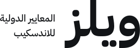
Arabic lock-up: the Arabic wordmark with its descriptor

Arabic lock-up. Proposed, not yet approved. The descriptor sits on the left, the reading-end side.

2.3 · Clear space

Keep one H free on every side.

H is the cap height of WILS, which is 0.713 times the wordmark size. Leave H of empty space above, below, left and right.

No type, rule, image edge or page edge may enter this zone. In site chrome, the header padding equals H.

H at common sizes
Wordmark sizeH
88 px62.7 px
40 px28.5 px
26 px (site header)18.5 px
Rule

Clear space is measured from the outermost ink of the logo, not from its box.

The tinted zone is clear space. Each marked square is one H.

2.4 · Minimum size

Below 40 px, drop the descriptor.

Sizes are the wordmark font size. The lock-up goes down to 40 px on screen, or 12 mm in print. Smaller than that, use the compact wordmark alone.

The compact wordmark goes down to 20 px, or 6 mm.

Minimum sizes
FormScreenPrint
Lock-up40 px12 mm
Compact wordmark20 px6 mm
Arabic wordmark20 px6 mm
Favicon16 pxNot for print
World’s International
Landscape Standard
Lock-up · 40 px / 12 mm
Compact · 20 px / 6 mm

Both forms at their smallest allowed size, shown at true screen size.

2.5 · Colour versions

One colour at a time.

The logo is always a single colour. Use Ink on Paper first. Reverse it to Paper on Ink or on Delta Teal. Delta Teal on Paper is the one coloured version on white.

For one-colour print, stamps and engraving, use pure black. This is the only place where #000000 is allowed.

World’s International
Landscape Standard
Primary

Ink on Paper. #121417 on #FFFFFF.

World’s International
Landscape Standard
Reversed

Paper on Ink. #FFFFFF on #121417.

World’s International
Landscape Standard
Lead

Delta Teal on Paper. #00666F on #FFFFFF.

World’s International
Landscape Standard
Reversed

Paper on Delta Teal. The home hero field.

World’s International
Landscape Standard
Print

Mono black. #000000, one-colour print only.

World’s International
Landscape Standard
Reversed

Paper on a plant-group field. Paper on Trees, Shrubs and Climbers. Ink on Palms and Groundcovers.

The six allowed versions. A group colour is never a logo colour.

2.6 · Favicon and app icon

The compact wordmark on Delta Teal.

The favicon is the W of the wordmark in Paper, centred on a Delta Teal square. It is the one place a single letter stands for WILS: at 16 px the full word cannot be read.

At 32 px it reads cleanly. At 16 px the word still reads, but only just. This is the one size below the 20 px minimum.

Icon files
FileSize
favicon.svg32 × 32 grid
favicon-32.png32 × 32 px
favicon.ico16 and 32 px
apple-touch-icon.png180 × 180 px
Favicon at 128 px
128 px
Favicon at 32 px
32 px
Favicon at 16 px
16 px
App icon, 180 px master shown at 120 px
App icon, 180 px

Favicon at three sizes, and the app icon. The app icon is full-bleed and square. The phone rounds the corners, not us.

2.7 · Misuse

Never change the logo.

These are the common mistakes. Each one breaks a rule above.

Rule

If a use is not shown in this chapter, do not invent it. Ask first.

Don’t

Add an icon or symbol.

Don’t

Recolour it to a group colour.

Don’t

Slant it. WILS Sans has no italic.

Don’t

Stretch or squash it.

Don’t

Add a shadow, glow or outline.

Don’t

Fill it with a gradient.

Free plant library
for designers
Don’t

Reword the descriptor.

World’s International Landscape Standard
Don’t

Reflow the descriptor to one line.

Don’t

Put it in a rounded container.

Nine things never to do with the logo.