Chapter 7.0

Layout & components

A 12-column grid, one breakpoint and a short list of flat, square parts.

  1. 7.1Grid
  2. 7.2Breakpoint
  3. 7.3Header
  4. 7.4Search bar
  5. 7.5Spec rows
  6. 7.6Plant card
  7. 7.7Buttons and links
  8. 7.8Map
  9. 7.9Name block
  10. 7.10Score bars
  11. 7.11Hardscape fields
  12. 7.12Drawing views
  13. 7.13Footer
  14. 7.14Icons
  15. 7.15Arabic and right to left

7.1 · Grid

12 columns, square edges.

The page is a 1280 px frame with 32 px margins, 12 columns and 24 px gutters. On small screens the margins drop to 16 px.

Space comes from a 4 px base. Use steps of 4, 8, 12, 16, 24, 32, 48 and 64. Nothing is rounded and nothing has a shadow.

Grid
Frame1280 px maximum
Columns12
Gutter24 px
Margin32 px (16 px on small screens)
Base unit4 px
Hairline1 px
Strong rule2 px
12-column gridA 1280 pixel frame with 32 pixel margins, twelve columns of about 79 pixels and 24 pixel gutters.123456789101112243279

The 12-column frame at 1280 px. Margins and gutters are drawn to scale.

Spacing steps. Step n is 4 px × n.

7.2 · Breakpoint

One breakpoint, at 1100 px.

Above 1100 px the page uses the full grid. At 1100 px and below, everything stacks into one column and the margins become 16 px.

The header has its own step. At 900 px and below, the five links move into a menu button.

Widths
WidthLayout
Over 110012 columns, 32 px margins, full header
901 to 1100One column, 16 px margins, full header
900 and belowOne column, 16 px margins, menu button

Design and check at 1280 px for desktop and 390 px for mobile.

Width ranges A bar from 0 to 1440 pixels. Up to 900 pixels: one column and a menu button. From 900 to 1100: one column with the full header. Above 1100: twelve columns. One column Menu button 12 columns 32 px margins One column,full header 090011001440 px

Widths in pixels, from 0 to 1440.

7.3 · Header

Lock-up at the left, account at the right.

The header is 64 px tall (56 px on small screens) with a hairline underneath. The full lock-up sits at the left. Five links and a square account icon sit at the right.

The page you are on has a 2 px Ink underline. Links are WILS Sans Medium. At 900 px and below the links fold into a menu button.

Links
Plants, Countries, Hardscape, Contribute, About
Height
64 px, 56 px on small screens
Link gap
24 px
Account
40 px square, hairline frame, plain person icon

Desktop header. This specimen folds to the menu button when its box is narrower than 700 px.

Mobile header, 375 px wide, 56 px tall.

7.4 · Search bar

One big box and one Ink button.

The search bar is 56 px tall with a 1 px Ink frame. The magnifier and the hint sit on the left in Muted. The button is solid Ink with Paper text in Bold. It turns Delta Teal on hover. Delta Teal is for links, hover and the lead field, not for the resting button.

Under the home search the five plant groups are plain text links, with no chips and no icons.

Height
56 px
Frame
1 px Ink, square
Hint
Muted, 17 px
Button
Ink fill, Paper Bold text
Focus
3 px Delta Teal outline, 2 px out

The home search with the five group links. It works: type in it.

Albizia
Search

Focus state with text entered.

7.5 · Spec rows

Label left, value right.

Plant facts are plain rows. The label is at the left in Medium and the value is at the right in Regular. A 1 px hairline runs under every row.

Rows are grouped under a short Bold heading: Dimensions, Plant, Site, Use. A missing value is left out. Nothing is guessed.

Heading
Bold 14 px
Row
15 px, about 11 px above and below
Label column
40 % of the row
Rule
1 px hairline, no frame

Dimensions

Height
15–20 m
Spread
12–18 m
Spacing
12 m

Plant

Type
Tree
Family
Fabaceae
Form
Irregular, Spreading, Rounded
Growth rate
Fast to very fast
Foliage
Deciduous, Drought-deciduous

Site

Sun
Full sun
Water use
Moderate to high
Lowest temperature
−3 °C

Spec rows as on the plant sheet.

7.6 · Plant card

A drawing, a name, a common name.

A plant card is the render on a white plate with a hairline frame. Under it sits the botanical name in Bold with the group dot, then the common name in Muted. A hardscape card works the same way, with the hardscape group dot (Surfaces, Edges & walls, Water & soil or Furniture & light).

The botanical name is upright. There is no price, no rating and no status text on a card.

Rule

The whole card is one link to the plant sheet. The drawing is never cropped.

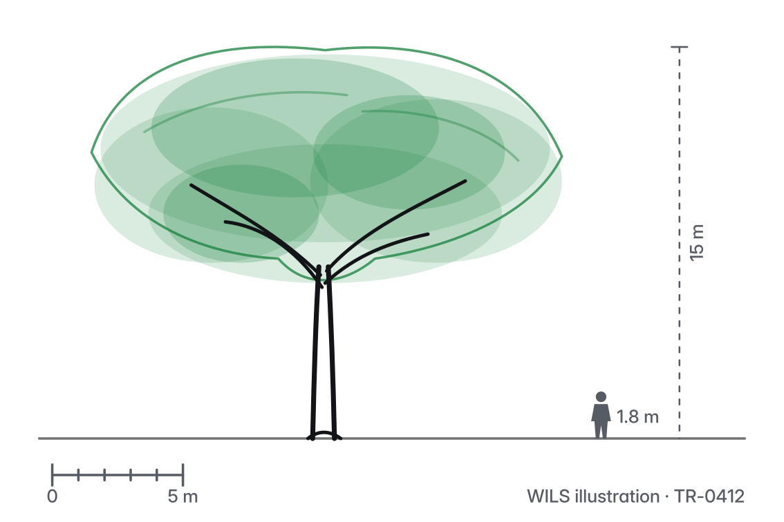
Albizia lebbeck render

Albizia lebbeck

Woman’s tongue

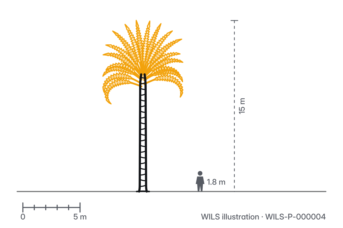
Phoenix dactylifera render

Phoenix dactylifera

Date palm

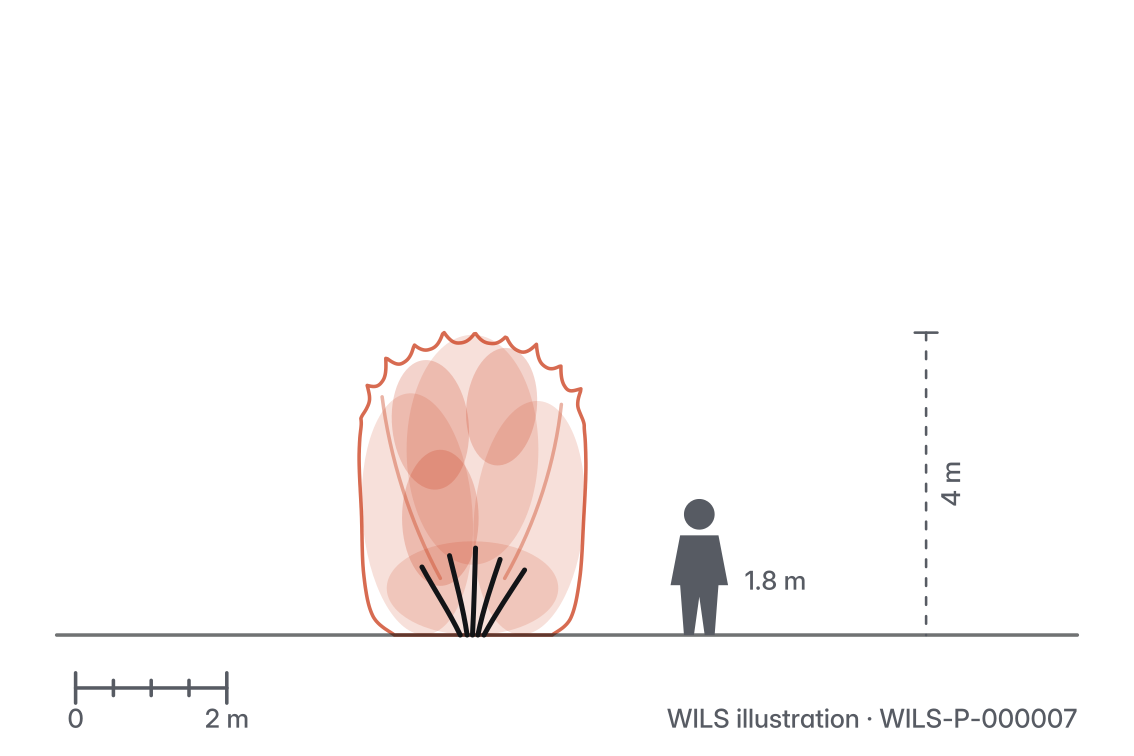
Nerium oleander render

Nerium oleander

Oleander

Three plant cards, one for each of three groups.

7.7 · Buttons and links

Ink fills. Teal links.

The main action is a solid Ink button with Paper text. The second action is an outline button with an Ink frame. Both are 48 px tall, square, with Bold text.

Links in text are Delta Teal with an underline. On hover the main button turns Delta Teal. Every control shows a 3 px Delta Teal outline on focus.

Height
48 px minimum
Text
Bold 16 px
Corners
Square
Link
Delta Teal, underlined
DefaultHoverFocus Primary Secondary Link Read more Read more Read more

Hover and focus are shown fixed so they can be compared.

Download rows: a label, an arrow, a hairline.

7.8 · Map

Flat fields. Linked countries in teal.

The map is built from flat fields. Land is Ink at 16 %. Water is Paper. Countries with plants are Delta Teal and are links. A white line separates every country.

Cities are small dots: white fill, 2 px Ink ring. Zoom controls sit at the top right as a stack of two square buttons, + and −.

Rule

No gradients, no shading, no 3D. Use only the fields below.

Map fields A drawing of the map parts: grey land, two countries in Delta Teal with white lines between them, and two city dots.

Map fields, a city dot and the zoom stack. The shapes are a drawing, not a real map.

Land
Ink 16 %
Linked country
Delta Teal
Water, borders
Paper
Hover
Ink

The four fields of the map.

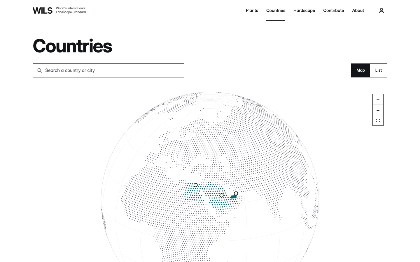
The Countries page: a search box for a country or city, a Map and List switch, and a map where Egypt, Saudi Arabia and the United Arab Emirates are Delta Teal with city dots.
The Countries page on the live site.

7.9 · Name block

The plant’s name, in its group’s colour.

The plant sheet opens with one colour field, the plant’s group colour, and nothing else on the page is coloured. The field holds the type and family as a label, the binomial at 40 px Bold, then the common name and the Arabic name on one line in Medium.

At the end of the field sits a framed square of the plant’s own planting plan: the plan is cut to the group’s symbol and drawn in the on-colour, inside a 1 px line in the same colour.

Under the field, three dimensions sit in one row: height, spread and spacing, each a label over a large number with its unit in Regular.

Rule

One field per sheet, full width of the text column. Ink on Palms and Groundcovers, Paper on Trees, Shrubs and Climbers. No photograph and no drawing on the field.

Tree · Fabaceae

Albizia lebbeck

Woman’s tongueلبخ

Height8–25m
Spread6–18m
Spacing12m

The name block for a tree, then the dimensions row. Trees green, Paper text, the plan grid at the end.

7.10 · Score bars

Five cells, one group colour.

“At a glance” turns words in the data into one to five steps. Each row is a label, a bar of five cells and the value in words. Filled cells are the group colour, empty cells its 10 % tint. A striped cell shows a span where sources differ.

The steps are a WILS scale, the same for every plant, never a source value. A longer bar means more of that trait. For water use and upkeep, more costs more.

Steps
Bar1 to 5
Water, drought, salt, wind, upkeepvery low, low, moderate, high, very high
Growth ratevery slow, slow, moderate, fast, very fast
Sunshade 1, part shade 2, part sun 3, full sun 5
Lifespanshort 1, medium 3, long 5
Cold10 °C or warmer 1, down to 5 °C 2, to 0 °C 3, to −10 °C 4, below 5
Rule

Cells are 14 px tall with a 3 px gap, square. No numbers on the bar, no stars, no half cells.

  • Water useLow to moderate
  • Growth rateFast
  • UpkeepLow
  • SunFull sun
  • LifespanMedium
  • Drought toleranceVery high
  • Salt toleranceMedium
  • Cold toleranceDown to 0 °C

Above, a tree. Below, a shrub. The striped third cell in the first row shows a span, “low to moderate”.

7.11 · Hardscape fields

Four fields, eight areas.

The Hardscape page is four flat colour fields in a two-column grid, one per hardscape group. Each field holds the group name at the top and its two areas at the foot as rows, ruled with a line in the on-colour at 36 %.

The fields are the page. There are no cards, no tints and no pictures on the fields.

Rule

Ink text on Sandstone, Paper text on Granite, Cobalt and Corten. The fields wipe in from the start edge (chapter 10.0).

  • Surfaces

    • Paving
    • Play surfaces
  • Edges & walls

    • Edges and kerbs
    • Walls and steps
  • Water & soil

    • Drainage
    • Tree pits and grates
  • Furniture & light

    • Street furniture
    • Lighting

The four hardscape fields at a small size. On the site each is at least 300 px tall.

7.12 · Drawing views

One picture, four views under it.

The plant sheet shows one large picture on a white plate. Under it, a strip of square thumbnails switches the view: Drawing, Elevation, Top view and Photos. The chosen view has a 1 px Ink ring inside its frame and a 2 px Ink rule under its label.

Elevation and Top view each carry a two-way switch, Sketch or Colour, between the ink sketch and the watercolour. Photos opens the real photographs with their captions.

Rule

The large picture never crops. The strip shows one thumbnail per view, never more than five.

The view strip and the Sketch / Colour switch. Labels in the Label style.

7.13 · Footer

One line, hairline above.

The footer is one row: the five site links at the start, the copyright line and the domain at the end, all in 13 px Muted on Paper, with a 1 px hairline above. Links turn Ink and underline on hover.

There is no second logo, no social icons, no newsletter box and no partner line.

The site footer. On a phone the links wrap and the copyright drops under them.

7.14 · Icons

Twelve icons, one pen.

WILS uses twelve icons and draws no others. Each sits on a 24 px grid and is one 1.8 px Ink stroke with square ends and no fill. They are the same in both languages; Back and Forward swap in Arabic.

Icons never stand alone as decoration and never replace a word in running text. A button with an icon only has a label for screen readers.

Rule

No icon libraries, no filled icons, no rounded caps, no two-tone. Need a thirteenth? Add it here first.

Search
Account
Menu
Close
Back
Forward
Down
Download
Open
Zoom in
Zoom out
Remove

The icon set at 24 px. Search, Account, Menu, Close, Back, Forward, Down, Download, Open, Zoom in, Zoom out, Remove.

7.15 · Arabic and right to left

Mirror the layout, not the content.

Arabic pages set dir="rtl" on the document. Everything that has a start and an end flips: the lock-up sits at the right, navigation reads from the right, labels sit at the right of a row and the planting plan is mirrored. Drawings, photographs, numbers and the map do not flip.

In the name block the Arabic name leads at 36 px Bold with open leading, and the binomial follows in Latin, upright, at 20 px. Digits stay Western.

ويلزالمعايير الدولية
للاندسكيب
شجرة · البقوليات

لبخ

Albizia lebbeckشجرة ظل للمواقع الحارة

The header and the name block mirrored for Arabic. The plan grid moves to the start edge, which is now the left.